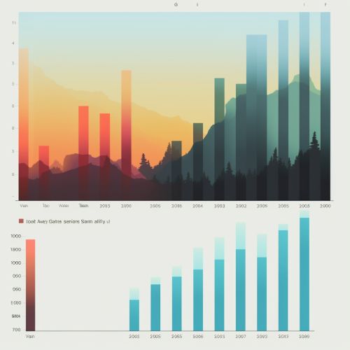
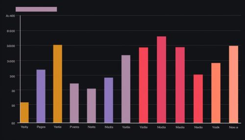
Bar Chart
Introduction
A bar chart or bar graph is a chart or graph that presents categorical data with rectangular bars with heights or lengths proportional to the values that they represent. The bars can be plotted vertically or horizontally. A vertical bar chart is sometimes called a line graph.
History
The bar chart is thought to have originated in the 1700s. It was first used by William Playfair, a Scottish engineer and political economist, to visualize economic data. By using bar charts, Playfair was able to compare and contrast different sets of data in a clear and concise manner.
Types of Bar Charts
There are several types of bar charts that are used depending on the nature of the data and the information that needs to be conveyed.
Simple Bar Chart
A simple bar chart is used when comparing the quantity, frequency, or other measure for a number of categories or groups.


Grouped Bar Chart
A grouped bar chart, also known as a clustered bar chart, is used to present the comparison of multiple categories of two or more groups.
Stacked Bar Chart
A stacked bar chart, or a piled bar chart, is used to break down and compare parts of a whole. Each bar in the chart represents a whole, and segments in the bar represent different parts or categories of that whole.
Horizontal Bar Chart
A horizontal bar chart is a variation on a vertical bar chart. It is sometimes used to represent comparison among categories when one axis does not have a numerical scale.
Construction of Bar Charts
The construction of a bar chart requires the following steps:
1. Identify the categories that need to be compared. These categories will be represented by the bars in the chart. 2. Determine the scale or the range of values that need to be represented on the chart. 3. Draw the axes of the chart. The horizontal axis (x-axis) represents the categories, and the vertical axis (y-axis) represents the values. 4. Plot the bars for each category with the height or length of the bar proportional to the value of the category. 5. Label the axes and the bars to provide information about the data.
Uses of Bar Charts
Bar charts are widely used in the fields of statistics, data analysis, and business intelligence. They are also commonly used in presentations and reports to represent and compare data.
Advantages and Disadvantages of Bar Charts
Like all data visualization tools, bar charts have their advantages and disadvantages.
Advantages
1. Bar charts are easy to understand and interpret. 2. They effectively represent and compare large sets of data. 3. They can represent data in a visually appealing way.
Disadvantages
1. Bar charts can be misleading if the scale is not properly defined. 2. They may oversimplify data, which can lead to incorrect interpretations. 3. They may not be suitable for representing complex data sets.
