Pie Chart
Overview
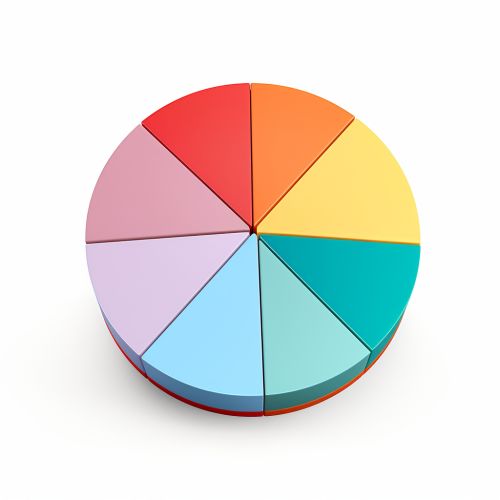
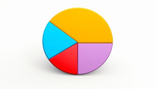
A pie chart is a type of graph that represents numerical data in a circular format, with the size of each 'slice' corresponding to the quantity it represents. The term "pie chart" was first coined in 1858 by French engineer and economist Charles Minard. The pie chart is a popular choice in many fields, including business, education, and media, due to its visual appeal and ease of understanding.
History
The earliest known pie charts were developed in the 1800s. The first known pie chart was created by William Playfair in 1801 in his book "The Statistical Breviary". Playfair was a Scottish engineer and political economist who pioneered the use of graphical representation of statistical data. He is also credited with inventing the line graph and the bar chart.
Construction
A pie chart is constructed by dividing a circle into sectors, each representing a proportion of the total. The size of each sector is proportional to the quantity it represents. The entire circle represents the total data set, and each sector represents a particular category within the data set. The angle of each sector, often expressed in degrees, is calculated as the proportion of the category multiplied by 360 degrees.
Usage
Pie charts are widely used in many fields for a variety of purposes. They are commonly used in business to represent financial data, such as sales figures or market share. In education, they are often used to illustrate the results of surveys or polls. In media, they are frequently used in infographics to present data in a visually appealing way.
Advantages
One of the main advantages of pie charts is their visual appeal. They are easy to understand, even for people with little or no experience in interpreting graphs. This makes them a popular choice for presenting data to a general audience. Another advantage is that they clearly show the relative proportions of different categories. This can be useful for comparing the sizes of different groups or for showing the distribution of data.
Disadvantages
Despite their advantages, pie charts also have some disadvantages. One of the main criticisms is that they can be misleading if not used correctly. For example, if the categories are not mutually exclusive, the total can add up to more than 100%, which can confuse the viewer. Another criticism is that they can be difficult to interpret accurately when there are many categories or when the differences between categories are small.
Variations
There are several variations of the pie chart, each with its own advantages and disadvantages. Some of the most common variations include the exploded pie chart, the 3D pie chart, and the doughnut chart. The exploded pie chart is a pie chart in which one or more sectors are separated from the rest of the chart. This is often used to highlight certain sectors. The 3D pie chart is a pie chart that is represented in three dimensions. This can make the chart more visually appealing, but it can also make it more difficult to interpret accurately. The doughnut chart is a variation of the pie chart in which the center of the circle is removed, creating a ring shape.


