Visual Hierarchy in Design
Visual Hierarchy in Design
Visual hierarchy is a fundamental principle in the field of design, encompassing graphic design, web design, user interface design, and more. It refers to the arrangement and presentation of elements in a way that implies importance, guiding the viewer's eye to the most critical parts of the design first. This principle leverages various design techniques to create a structured and intuitive visual experience.
Principles of Visual Hierarchy
Visual hierarchy is built upon several core principles that help designers effectively communicate the intended message. These principles include:
Size and Scale
The size of elements is one of the most straightforward ways to establish visual hierarchy. Larger elements naturally draw more attention than smaller ones. For instance, in typography, headings are often larger than body text to signify their importance.
Color and Contrast
Color can be used to highlight or de-emphasize elements. High contrast between an element and its background makes it stand out, while low contrast can make elements recede into the background. For example, a bright red button on a white background will attract more attention than a grey button.
Alignment and Proximity
Alignment and proximity help organize elements in a way that reflects their relationships. Elements that are aligned or grouped closely together are perceived as related, while those that are spaced apart are seen as separate. This principle is crucial in layout design.
Typography
Typography plays a significant role in visual hierarchy. Different font weights, styles, and sizes can be used to create a sense of order and importance. For example, bold and italicized text can be used to emphasize key points.
Whitespace
Whitespace, or negative space, is the empty space around elements. It helps to prevent a design from feeling cluttered and allows important elements to stand out. Effective use of whitespace can significantly enhance the readability and aesthetics of a design.


Techniques for Creating Visual Hierarchy
Designers employ various techniques to establish and enhance visual hierarchy in their work. These techniques include:
Z-Pattern and F-Pattern
The Z-pattern and F-pattern are common reading patterns that describe how people typically scan a page. The Z-pattern is often used in designs with minimal text, guiding the eye in a Z-shape across the page. The F-pattern is more common in text-heavy designs, where the eye scans in an F-shape, focusing on the left side and top of the page.
Rule of Thirds
The rule of thirds is a compositional technique that divides a design into nine equal parts using two equally spaced horizontal and vertical lines. Placing key elements along these lines or at their intersections creates a balanced and engaging composition.
Visual Weight
Visual weight refers to the perceived heaviness or lightness of an element. Elements with more visual weight, such as bold colors or large sizes, attract more attention. Designers can manipulate visual weight to guide the viewer's eye through the design.
Hierarchical Grid
A hierarchical grid is a layout structure that organizes content into a clear hierarchy. This grid helps maintain consistency and alignment, making it easier for viewers to navigate the design. It is commonly used in web design and print design.
Applications of Visual Hierarchy
Visual hierarchy is applied across various design disciplines to enhance user experience and communication.
Web Design
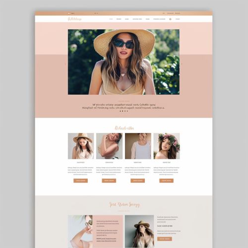
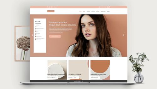
In web design, visual hierarchy is crucial for creating intuitive and user-friendly interfaces. It helps users quickly find the information they need and navigate the site efficiently. Key elements such as navigation menus, call-to-action buttons, and headlines are strategically placed to guide the user's journey.
Graphic Design
Graphic designers use visual hierarchy to create compelling and effective visual communications. Whether designing a poster, brochure, or advertisement, the arrangement of text and images is carefully considered to convey the intended message clearly and attractively.
User Interface Design
In user interface (UI) design, visual hierarchy ensures that users can interact with the interface effortlessly. Important actions and information are highlighted, while less critical elements are de-emphasized. This approach enhances usability and overall user satisfaction.
Print Design
Print design, including magazines, newspapers, and books, relies heavily on visual hierarchy to organize content and improve readability. Designers use headings, subheadings, images, and whitespace to create a logical flow and emphasize key points.
Challenges in Establishing Visual Hierarchy
Creating an effective visual hierarchy can be challenging, as it requires a deep understanding of design principles and user behavior. Some common challenges include:
Balancing Complexity and Simplicity
Designers must strike a balance between providing enough information and avoiding clutter. Overloading a design with too many elements can overwhelm the viewer, while too few elements can leave the design feeling sparse and uninformative.
Maintaining Consistency
Consistency in design elements, such as fonts, colors, and spacing, is essential for a cohesive visual hierarchy. Inconsistent use of these elements can confuse viewers and disrupt the intended flow of information.
Adapting to Different Devices
With the rise of responsive design, designers must ensure that visual hierarchy is maintained across various devices and screen sizes. Elements that work well on a desktop may need to be adjusted for mobile or tablet displays.
