Grid (graphic design)
Introduction
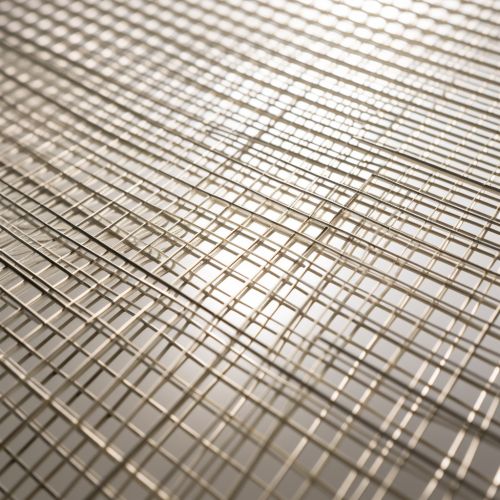
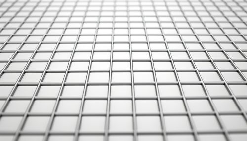
The grid in graphic design is a fundamental concept that allows designers to organize visual elements in a systematic and consistent manner. It is a structure made up of a series of intersecting vertical, horizontal, and (sometimes) angular lines used to structure content. The grid serves as an armature on which a designer can organize graphic elements in a rational, easy-to-absorb manner.
History
The concept of the grid has been present in design from as early as the manuscript era, where scribes used it to ensure consistent placement of text and illustrations. In the 20th century, the grid became a key tool in the modernist design movement, with designers like Jan Tschichold and Josef Müller-Brockmann pioneering its use in graphic design.
Types of Grids
There are several types of grids used in graphic design, each with its own purpose and application.
Manuscript Grid
The manuscript grid is the simplest type of grid, consisting of a single large rectangular area. It is most commonly used in the design of long texts, such as books and reports.
Column Grid
A column grid consists of a few vertical columns that help organize content horizontally. This type of grid is often used in magazines and newspapers, where information needs to be organized in a more complex way.
Modular Grid
A modular grid divides the page both vertically and horizontally, creating modules that can be used to organize content. This type of grid is often used in web and interface design, where flexibility and control over the layout are crucial.
Hierarchical Grid
A hierarchical grid is a custom grid created for a specific project. It is not based on equal-sized columns or modules, but rather on the proportional relationships between elements, making it ideal for complex projects that require a high level of control.
Principles of Grid Design
Designing with a grid requires understanding of several key principles.
Consistency
Consistency is key in grid design. The grid should be applied consistently across all pages or screens to create a cohesive feel.
Balance
Balance is another important principle in grid design. The grid should help to balance the visual weight of elements on the page, creating a harmonious layout.
Proportion
The grid can also be used to create proportional relationships between elements. This can be achieved by using a grid system based on a specific ratio, such as the golden ratio.
Alignment
Alignment is a key principle in grid design. The grid provides a framework for aligning elements, helping to create a clean and organized layout.
Grids in Different Design Disciplines
The use of grids is not limited to graphic design. They are used in various design disciplines, each with its own specific requirements and challenges.
Web Design
In web design, grids are used to create flexible layouts that can adapt to different screen sizes and devices. This is often achieved through the use of responsive grid systems.
Architecture
In architecture, grids are used to organize space and structure buildings. They can be seen in the layout of cities, the design of buildings, and even in interior design.
Typography
In typography, grids are used to organize text and ensure consistent spacing and alignment. They are crucial in the design of books, magazines, and other text-heavy designs.
Advantages and Disadvantages of Using Grids
Like any design tool, grids have their advantages and disadvantages.
Advantages
Grids can help to create consistency, balance, and harmony in a design. They can simplify the design process by providing a clear framework for the placement of elements. They can also help to create designs that are easier to read and navigate.
Disadvantages
On the other hand, grids can sometimes limit creativity by imposing a rigid structure. They can also be time-consuming to set up and may not be suitable for all projects.
Conclusion
The grid is a fundamental tool in graphic design, providing a framework for organizing visual elements. While it has its limitations, its benefits in creating consistent, balanced, and harmonious designs are undeniable.


