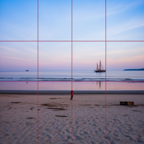
Rule of Thirds
Introduction
The Rule of Thirds is a fundamental principle in visual arts, particularly in photography and painting, that suggests an image can be divided into nine equal parts by two equally spaced horizontal lines and two equally spaced vertical lines. The theory posits that placing points of interest along these lines, or at the intersections thereof, makes the image more balanced and enables a more engaging interaction with the viewer.
Origin and History
The concept of the Rule of Thirds has been used for centuries and is thought to date back to the Renaissance period. Artists during this time were known to use this rule to create visually appealing compositions in their works. However, the term "Rule of Thirds" was first coined by John Thomas Smith in 1797 in his book "Remarks on Rural Scenery".
Application in Photography
In photography, the Rule of Thirds is applied by aligning a subject with the guide lines and their intersection points, placing the horizon on the top or bottom line, or allowing linear features in the image to flow from section to section. The central idea is that an off-center composition is more pleasing to the eye and appears more natural than one where the subject is placed right in the middle of the frame.
Application in Painting
In painting, the Rule of Thirds is used as a guide for creating balance and interest in the artwork. By dividing the canvas into thirds both horizontally and vertically, artists can position the most important elements of their painting along these lines or at their intersections. This technique helps to create a sense of balance and harmony in the composition.
Application in Design
The Rule of Thirds is also widely used in graphic and web design. By dividing a page into thirds, designers can create a grid that helps them to arrange elements on the page in a way that is visually appealing and effective in guiding the viewer's eye.
Criticisms and Limitations
While the Rule of Thirds is widely accepted and used, it is not without its criticisms. Some argue that it is overly simplistic and can lead to predictable and boring compositions if followed too rigidly. Others suggest that different compositional techniques, such as the Golden Ratio, can offer more flexibility and complexity in creating visually appealing images.
Conclusion
The Rule of Thirds is a powerful tool for creating balanced and engaging compositions in various fields of visual arts. While it is not a hard and fast rule, it serves as a useful guideline for artists, photographers, and designers in their work. However, like any artistic rule, it can and should be broken when the composition calls for it.
See Also


