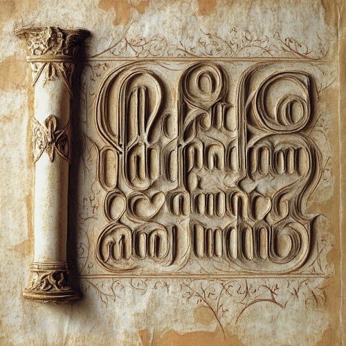
Gothic script
Introduction
Gothic script, also known as Blackletter, is a script style that originated in Western Europe during the Middle Ages. It is characterized by its dense, dark, and angular appearance, which sets it apart from other script styles such as Carolingian minuscule and Roman typefaces. Gothic script was widely used from the 12th to the 17th centuries, particularly in Germany, England, France, and the Low Countries. This article delves into the historical development, characteristics, variations, and influence of Gothic script.


Historical Development
Origins
Gothic script emerged in the 12th century as a response to the evolving needs of medieval society. The script was developed to accommodate the increasing complexity of texts and the need for more efficient use of parchment. The origins of Gothic script can be traced back to the Carolingian minuscule, which was the dominant script in Europe before the rise of Gothic script. The transition from Carolingian minuscule to Gothic script was gradual, with scribes experimenting with different forms and styles.
Evolution
The evolution of Gothic script can be divided into several phases, each marked by distinct stylistic changes. The early phase, known as Textualis or Textura, featured tightly packed letters with minimal spacing. This style was particularly popular in religious texts and legal documents. As the script evolved, other variations such as Rotunda, Schwabacher, and Fraktur emerged, each with its unique characteristics.
Decline
The decline of Gothic script began in the 16th century with the advent of the printing press and the rise of humanist typefaces. The more legible and aesthetically pleasing Roman typefaces gradually replaced Gothic script in printed materials. However, Gothic script continued to be used in certain contexts, such as in Germany for official documents and in England for legal texts, until the 17th century.
Characteristics
Letterforms
Gothic script is characterized by its angular and rigid letterforms. The letters are typically tall and narrow, with sharp, pointed arches and diamond-shaped strokes. The script often features elaborate ascenders and descenders, which contribute to its dense and dark appearance. The letters are usually connected, creating a continuous flow of text.
Ligatures and Abbreviations
Ligatures and abbreviations are common features of Gothic script. Ligatures are combinations of two or more letters into a single glyph, which helps to save space and improve the flow of text. Abbreviations are used to shorten frequently occurring words and phrases, making the script more efficient for scribes and readers.
Ornamentation
Ornamentation is another key characteristic of Gothic script. Manuscripts often feature decorative elements such as illuminated initials, intricate borders, and elaborate flourishes. These embellishments not only enhance the visual appeal of the text but also serve to highlight important sections and guide the reader's eye.
Variations
Textualis
Textualis, also known as Textura, is the earliest and most formal variation of Gothic script. It is characterized by its tightly packed letters, minimal spacing, and uniform appearance. Textualis was widely used in religious texts, legal documents, and other formal writings.
Rotunda
Rotunda is a variation of Gothic script that emerged in Italy and Spain. It is characterized by its rounder and more open letterforms, which make it more legible than Textualis. Rotunda was often used in liturgical texts and other religious manuscripts.
Schwabacher
Schwabacher is a variation of Gothic script that developed in Germany during the 15th century. It is characterized by its more rounded and less angular letterforms compared to Textualis. Schwabacher was commonly used in printed books and official documents.
Fraktur
Fraktur is a variation of Gothic script that became popular in Germany during the 16th century. It is characterized by its elaborate and ornate letterforms, with a high degree of contrast between thick and thin strokes. Fraktur was widely used in printed materials, including books, newspapers, and official documents.
Influence and Legacy
Cultural Impact
Gothic script had a significant cultural impact during the Middle Ages and beyond. It was the dominant script style in Western Europe for several centuries, shaping the way texts were written, read, and perceived. The script's dense and dark appearance was well-suited to the solemn and serious nature of religious and legal texts.
Modern Usage
Although Gothic script is no longer widely used, it continues to have a presence in modern culture. It is often associated with medieval and Gothic themes, and is used in various contexts such as logos, tattoos, and decorative designs. Gothic script also remains an important subject of study for paleographers and historians.
Digital Fonts
The influence of Gothic script can also be seen in the digital age, with numerous fonts inspired by its letterforms. These digital fonts are used in graphic design, typography, and other creative fields, allowing the legacy of Gothic script to continue in contemporary contexts.
