Box Plot
Introduction
A box plot, also known as a whisker plot, is a graphical representation used in statistics to depict groups of numerical data through their quartiles. The box plot is not only a summary of key values, but it also provides a graphical representation of the center, spread and skewness of the data set.


History
The box plot was introduced by American statistician John W. Tukey in 1970 as part of his toolkit for exploratory data analysis. Tukey was a pioneer in the field of statistics, and his work has had a profound impact on the way data is analyzed today. The box plot is one of his most enduring contributions, and it continues to be widely used in statistical analysis and data visualization.
Construction
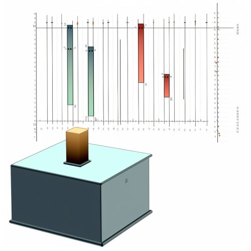
A box plot is constructed by drawing a box between the first quartile (Q1) and the third quartile (Q3) of the data set, with a line (the median) drawn inside the box to denote the second quartile (Q2). The "whiskers" of the box plot are lines extending from the box indicating variability outside the upper and lower quartiles, hence the name "box-and-whisker plot". Outliers are sometimes plotted as individual dots that are separate from the whiskers.
Quartiles
The quartiles of a data set divide the data into four equal parts. The first quartile (Q1) is the middle number between the smallest number and the median of the data set. The second quartile (Q2) is the median of the data. The third quartile (Q3) is the middle value between the median and the highest value of the data set.
Whiskers
The whiskers of a box plot represent the variability outside the upper and lower quartiles. They extend from the box to the highest and lowest observations within a distance of 1.5 times the interquartile range from the box. The interquartile range (IQR) is the range within which the middle 50% of the data values fall, calculated as Q3 - Q1.
Outliers
Outliers in a box plot are defined as observations that fall below Q1 - 1.5*IQR or above Q3 + 1.5*IQR. They are often marked with a dot or an asterisk.
Variations
There are several variations of the box plot, each with its own advantages and disadvantages. Some of the most common variations include the notched box plot, the variable width box plot, and the violin plot.
Notched Box Plot
A notched box plot includes a narrowing of the box around the median. This notch represents a confidence interval around the median. If the notches of two box plots do not overlap, this is a strong evidence that the medians differ.
Variable Width Box Plot
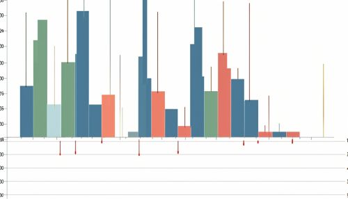
In a variable width box plot, the width of the box is proportional to the size of the group or the square root of the size of the group. This type of box plot is useful for visualizing the distribution of data across different groups when the sample sizes are different.
Violin Plot
A violin plot combines a box plot with a kernel density plot. This creates a plot that is symmetric around the median, and provides a better representation of the distribution of the data.
Advantages and Disadvantages
Box plots have several advantages. They are a simple way to visualize the distribution of data, and they can easily compare multiple data sets. They are also robust, as the box plot's representation of the data is not affected by outliers.
However, box plots also have disadvantages. They can obscure the underlying distribution of the data, and they do not display the individual data points. This can be a problem when dealing with small data sets, or when the details of the distribution are important.
Applications
Box plots are widely used in statistics, data analysis, and data visualization. They are particularly useful for comparing distributions across different categories. Box plots are commonly used in exploratory data analysis, quality control, and in the preparation of data for statistical testing or data mining.
